Start with the whole forecast
Read the chart from left to right. The horizontal direction is time; the main line rises and falls with temperature. Its hourly points also show cloud cover through color, while a blue area shows the chance of precipitation. These signals share one timeline, so you can see how conditions change together.
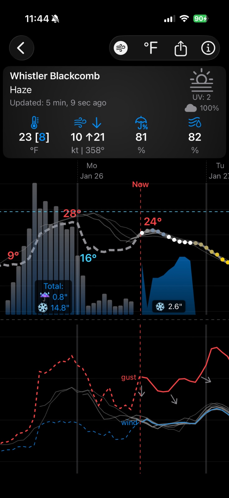
Temperature and cloud cover share the same points
The vertical position of each hourly point is temperature. Follow the line upward for warmer hours and downward for cooler ones. Labels mark local highs and lows, making the turning points easy to find without tracing every point against an axis.
The points' color describes cloud cover. Gray means fully cloudy, yellow means fully sunny, and a continuous gradient between them shows partial cloud cover. That lets you see, for example, whether the warmest hours will also be sunny.
The blue area shows precipitation probability
The height of the blue shaded area represents the chance of precipitation at each time point: the bottom is 0% and the top is 100%. A taller area means a higher probability; its width helps you see how long the wet period may last.
The area is about probability, not inches of rain. When an expected rain or snow event has a significant amount, Weathercaster adds an amount label to the shaded area. In the example above, the label shows 2.6 inches of forecast snow. Read that number separately from the height of the area.
Annotations show turning points and storm risk
Temperature labels identify local maximum and minimum values along the line. Lightning icons mark hours with a risk of lightning. Together with the precipitation area and point colors, these annotations help you spot when an event begins, how conditions change during it, and when it may clear.
The Now line separates observations from forecasts
The vertical Now line marks the present. To its left, you can see past observations; to its right, you see future forecast values. Keeping them on one timeline helps you compare what has happened with what is expected next.
Turn on the wind chart for speed and direction
The optional chart below the main forecast shows two wind-speed lines: one for sustained wind and one for gusts. Wind vectors along the chart show direction. Reading the lines together tells you whether a breezy period is building gradually, whether gusts will be much stronger than sustained wind, and when the wind is expected to ease.
In the example above, the gust line rises again later in the forecast, while the sustained-wind line stays below it. The vectors show wind direction along the timeline. A daily wind number would hide much of that timing.
Put the layers together
Imagine rain starting at 11 p.m. Friday and ending at 5 a.m. Saturday. A conventional weather app's 'daily summary might mark both days as rainy. In Weathercaster, the blue area shows the overnight rain window, its label can show the expected amount, and the temperature-point colors show whether clouds give way to sun afterward. You can quickly judge whether Saturday morning still works for a hike, then inspect a specific hour for more detail.
Forecasts can change, and the chart does not make uncertain weather certain. It gives you a faster way to read the available forecast and see which hours matter to your plans.